Doomsy
An AI film studio on your phone — one idea in, a finished film out
- Product
- AI
- Film
- Mobile
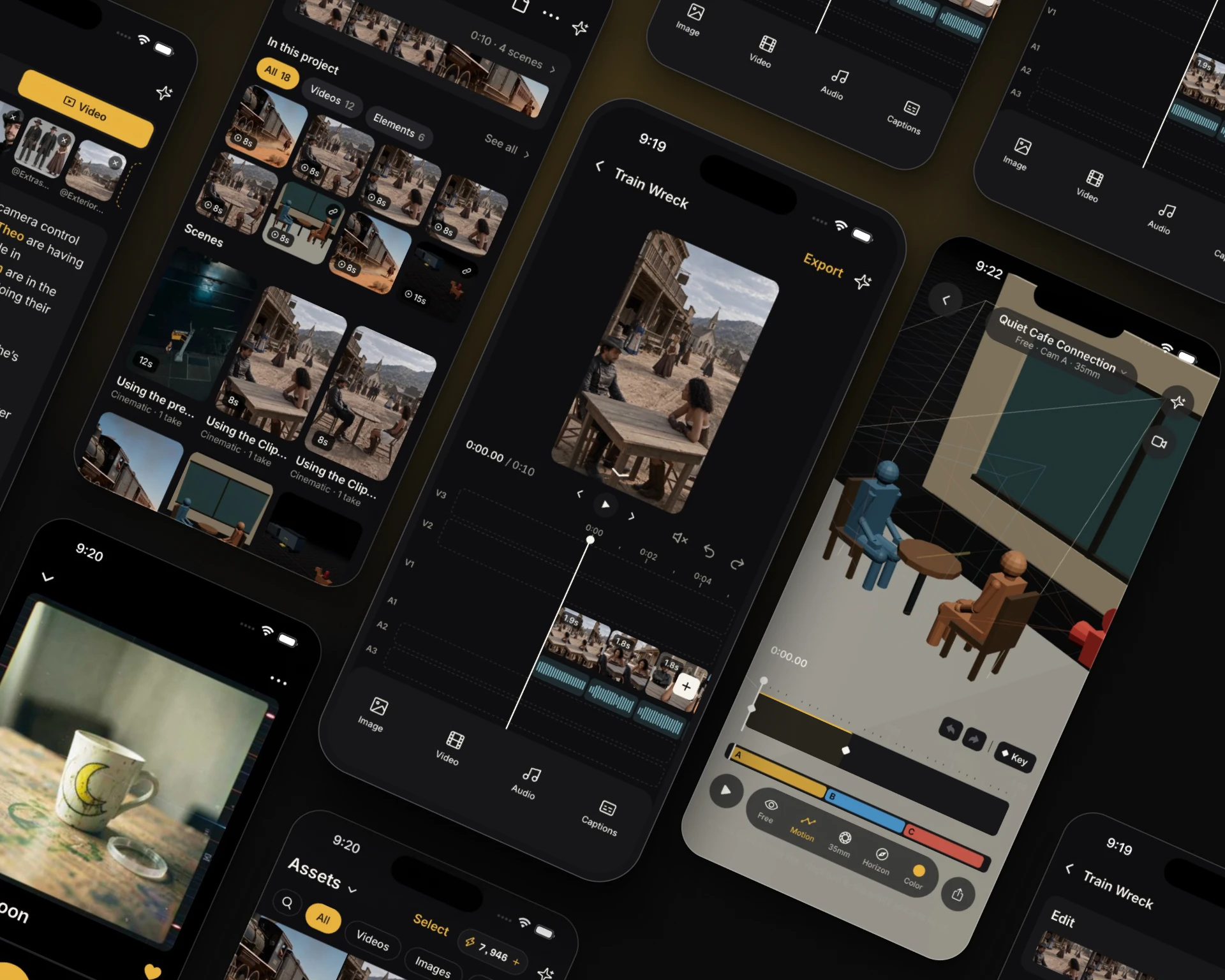
Product screens
From idea to edit
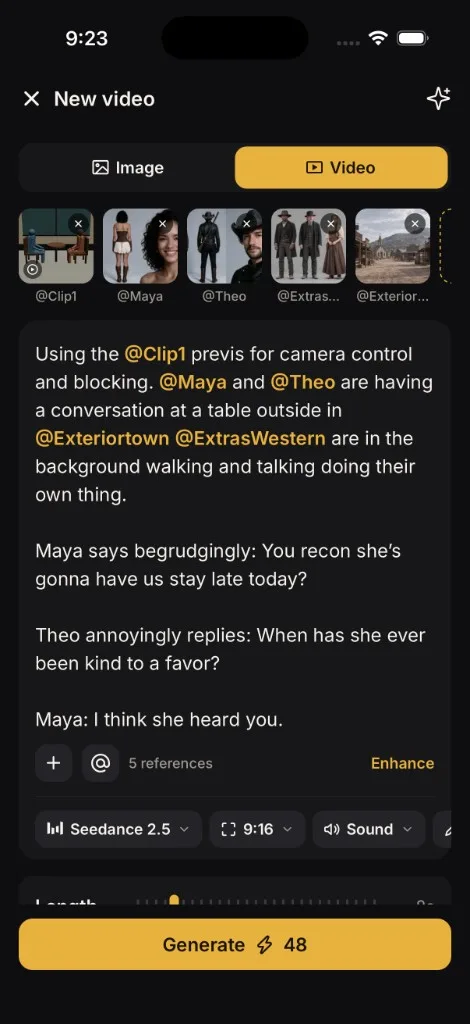
Key decision
Swap shot turned into an editor, and the editor reorganized the app
Before
The video page did the editing
Tap a shot to regenerate it, edit it, swap in another take, download it, or delete it. Every fix lived on one screen.
- Regenerate
- Edit
- Swap shot
- Download
- Delete shot
Oct 8
“We're essentially building a very simple NLE, where each cut is split into its own clips and we can drop in different versions.”
“If we have our editor, our current video screen doesn't need so many edit options. That will be handled in the edit.”
“Current projects are basically video takes if the editor holds the full project.”
After
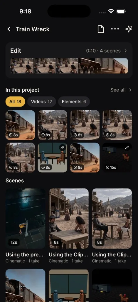
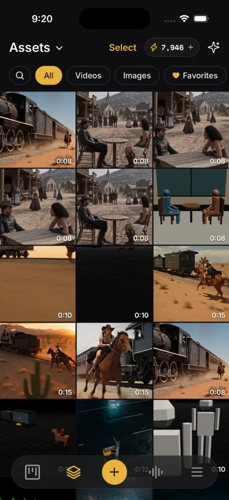
Projects open on a bin. The editor holds the cut.
A project houses scenes. Scenes house takes. Fixes happen in the edit, where you can see the whole film.
Data model
Project, then scenes, then takes. Renamed in code too, so the words match the screen.
Video page
It sheds the edit menu and goes back to watching takes and generating again.
Navigation
Projects, Assets, Create, Audio, More. Create opens a sheet, so it doesn't fight the old button.
Reach
A polished editor is what lets a film run longer than a single clip.
Overview
Doomsy turns one idea into a short film on your phone. It casts the film, writes the shots, voices them, scores them, and renders the takes. You cut it yourself.
I design and build the iOS app, and I direct the films in it, including Clean Glass and Train Wreck. It started as a feed of on-brand posts. When image models made that easy for everyone, I dropped it and rebuilt around how a film actually gets made.
Problem
AI video tools hand you a clip. A film needs a cast that holds from shot to shot, shots that cut together, voices, music, and an edit. That work usually lives across several tools and a desktop editor.
Product design
I modeled the app on a real production, so every piece has an obvious home.
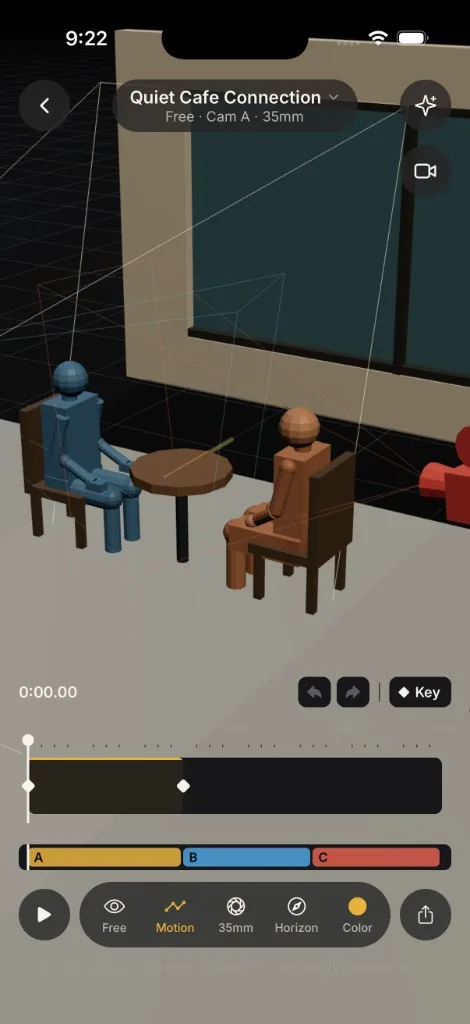
- Previs blocks the shot before you generate: stand-ins, a camera you can walk, a lens, and a horizon. Then you export the move.
- A project holds the brief, the look, the cast, and the scenes.
- Characters, places, and props live in Assets, each with variants.
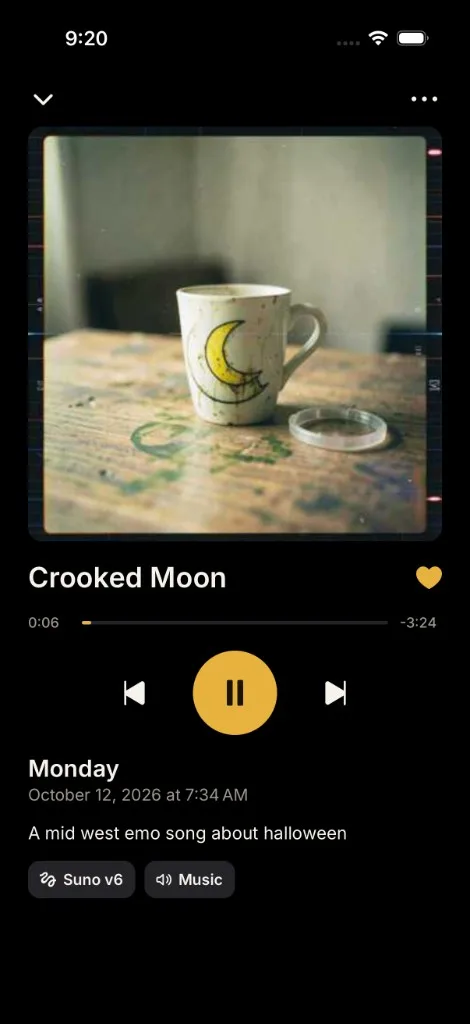
- Voices and music live in Audio, then land in the edit.
- Ask can fill in a step. You still press Generate.
The key decision
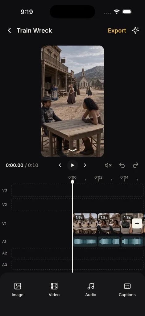
Editing first lived on the video page: regenerate a shot, swap a take, download it, or delete it. Getting swap to work, I wrote in my notes: “We're essentially building a very simple NLE.”
So I built one for a phone. Three picture tracks, three audio tracks, trim, split, and captions. Ask can describe a change, and one undo takes it back. Then I let the editor reorganize the app. A project opens on its scenes, and fixes happen in the edit, where you can see the whole film.
How I decided
Three rules kept settling the arguments:
- You stay in control. Ask fills the form. You press Generate.
- Nothing gets thrown away. Every take, edit, and regeneration stays.
- Show the cost, then confirm, before anything spends credits.
Outcome
A working iOS app and a landing at doomsy.ai. Product design, art direction, and the build in one seat.