Strumly
Redesign - a neon collage landing for local live music
- Redesign
- Brand
- Product
Layouts
Desktop and mobile

Before

Overview
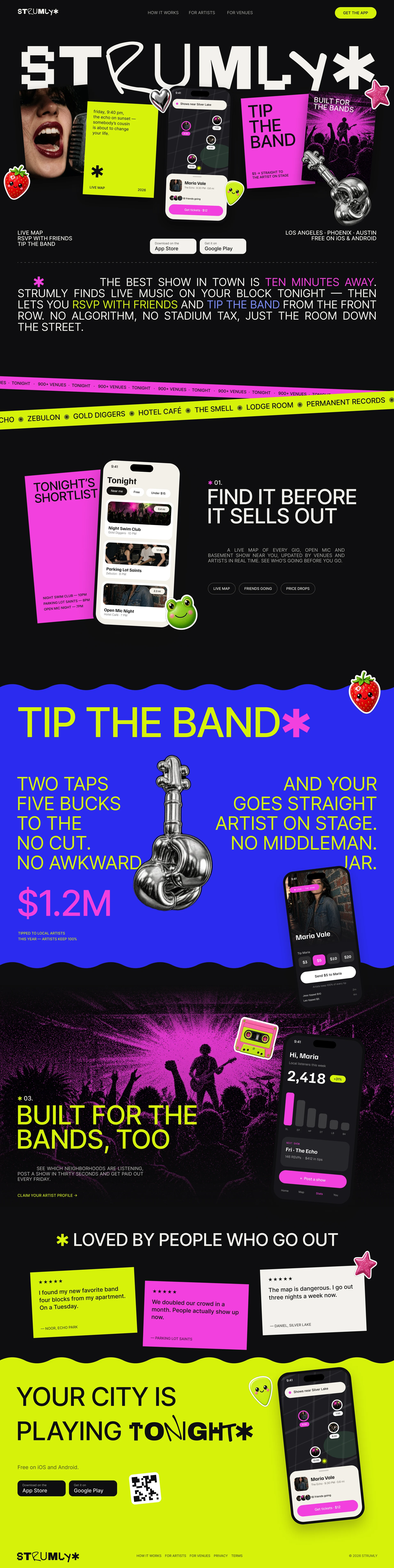
Strumly is a live map of gigs, open mics, and basement shows, with tipping that goes straight to the artist on stage. I designed the original landing; this 2026 refresh gives it the energy of a show flyer.
Problem
The original looked like most music apps of its time: a dark photo hero, a phone mockup, and a green accent, close to a streaming service. Strumly is about small local shows, so it should feel like something stapled to a telephone pole.
Design system
Near-black field with lime, hot pink, and cobalt. The wordmark and key phrases cycle through pixel, grotesk, and hand-drawn glyphs letter by letter, over clean Inter caps. A chrome guitar and die-cut stickers carry the collage.
- Collage hero of photo cards, stickers, and live app screens under a mixed-glyph wordmark
- Justified all-caps statement with inline color highlights
- Wavy cobalt “Tip the band” poster with the tipping flow on a phone
- Sticky-note reviews and a lime wave CTA
Outcome
Desktop 1440 and mobile 390 in Figma. Part of a four-site legacy refresh, and the loudest of the set.