UAV
Redesign - a Swiss-grid site for an aerial cinematography crew
- Redesign
- Brand
- Web
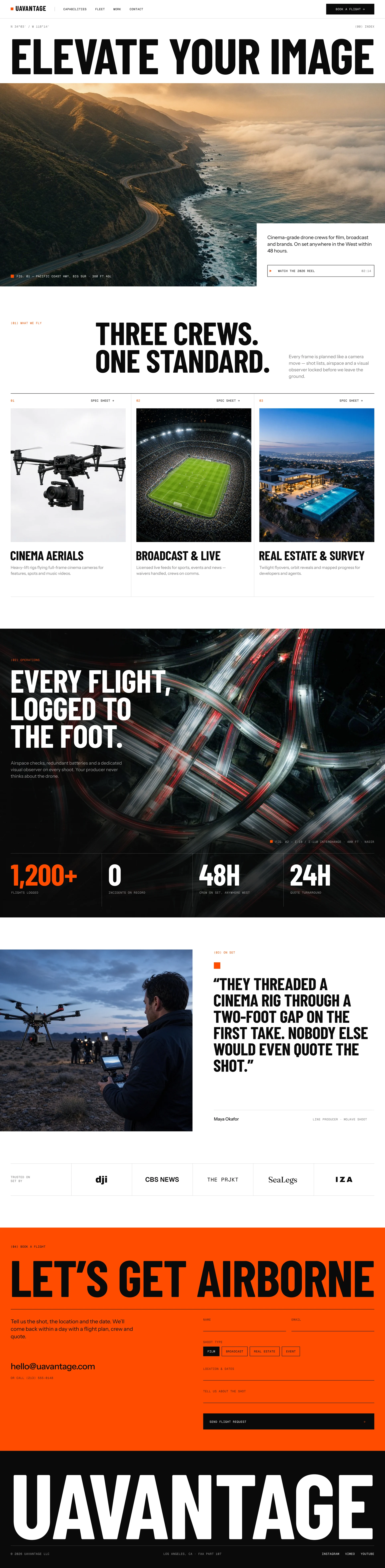
Layouts
Desktop and mobile

Before

Overview
UAVantage flies cinema-grade drone crews for film, broadcast, and real estate. I designed their original site; this is a 2026 pass that brings it up to how I'd design it today.
Problem
The original was a mid-2010s layout: a dark side panel, a small drone photo, offset boxes, and a thin “We Love Flying” headline. The footage never got room to lead, and nothing signaled the licensing, insurance, and set experience producers hire for.
Design system
Pure white and true black with one signal orange. Barlow Condensed Bold in caps for display, Instrument Sans for body, Geist Mono for coordinates and figure captions. Square corners and hairline rules throughout.
- Full-width headline over an edge-to-edge hero, with a white copy card cut into the photo
- Services as a three-column hairline grid instead of cards
- Operations as a full-bleed top-down shot, brightened in the open area and shaded only where the type sits
- Orange booking band and a giant wordmark footer
Outcome
Desktop 1440 and mobile 390 in Figma. One of four legacy client sites refreshed together, each pushed into its own layout, palette, and type so the set never reads as one template.